Compagnia de’ Colombari
Summer 2020–Present
In the summer of 2020, I started working for the NYC-based theater group Compagnia de’ Colombari as an independent graphic designer. I was originally hired to design and build a new website and design a new logo, stationery, and identity images for a selection of their productions. During that time our professional relationship strengthened, and I now manage most of their design needs, including website maintenance, gala signage, and images for all their productions.
From the start with Colombari, I set out to develop and maintain a consistent brand identity. The experimental theater company contains multitudes in their diverse group of artists; stages bold performances in a variety of cities, streets, and venues; and has a strong commitment to fostering community. I embodied these attributes and more in a consistent visual language that is bold and loud yet at the same time familiar and engaging.
Logo & Wordmark
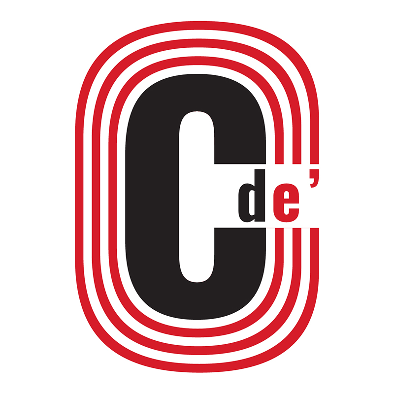
The logo takes inspiration from the ancient Greek theater of Epidaurus, the cascading red and white “steps” drawing the viewer into the center stage to engage with Colombari’s work. In line with the group’s original desire, the logo looks like it could be a sticker “slapped onto the side of a trunk.”
For the wider wordmark, the letters appear to be standing front and center on a stage as they are revealed to the viewer. The typeface for both the logo and wordmark is Oswald, a bold open-source sans-serif font that gives the theater company a modern voice to be reckoned with. Both were designed entirely in Adobe Illustrator.

Website
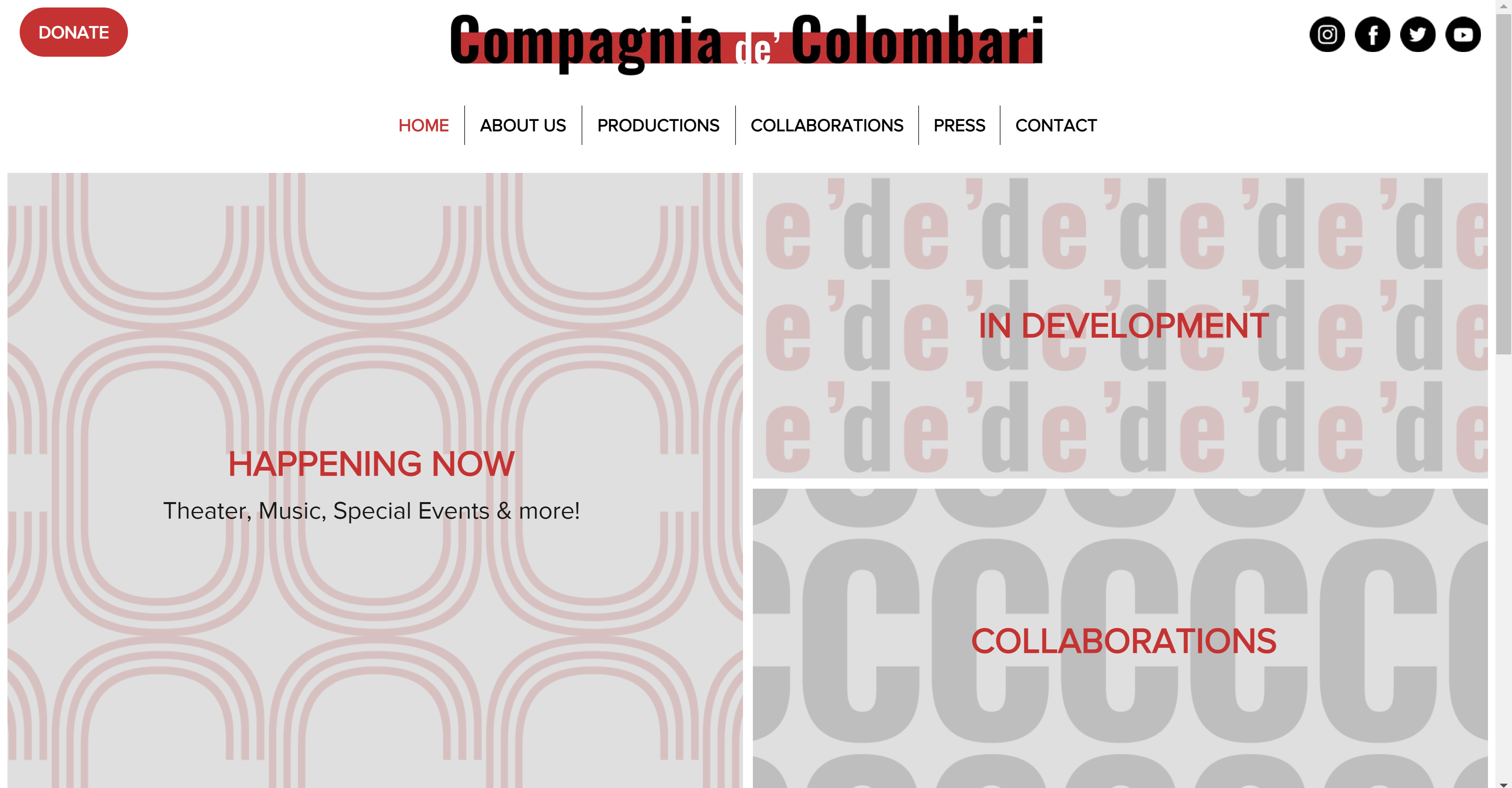
Similar to my intentions with the company’s logo, I designed Colombari’s website to be inviting and engaging first and foremost. With minimal distractions and a clear interface at their disposal, visitors to the site can easily explore as much or as little of the company’s work as they desire.
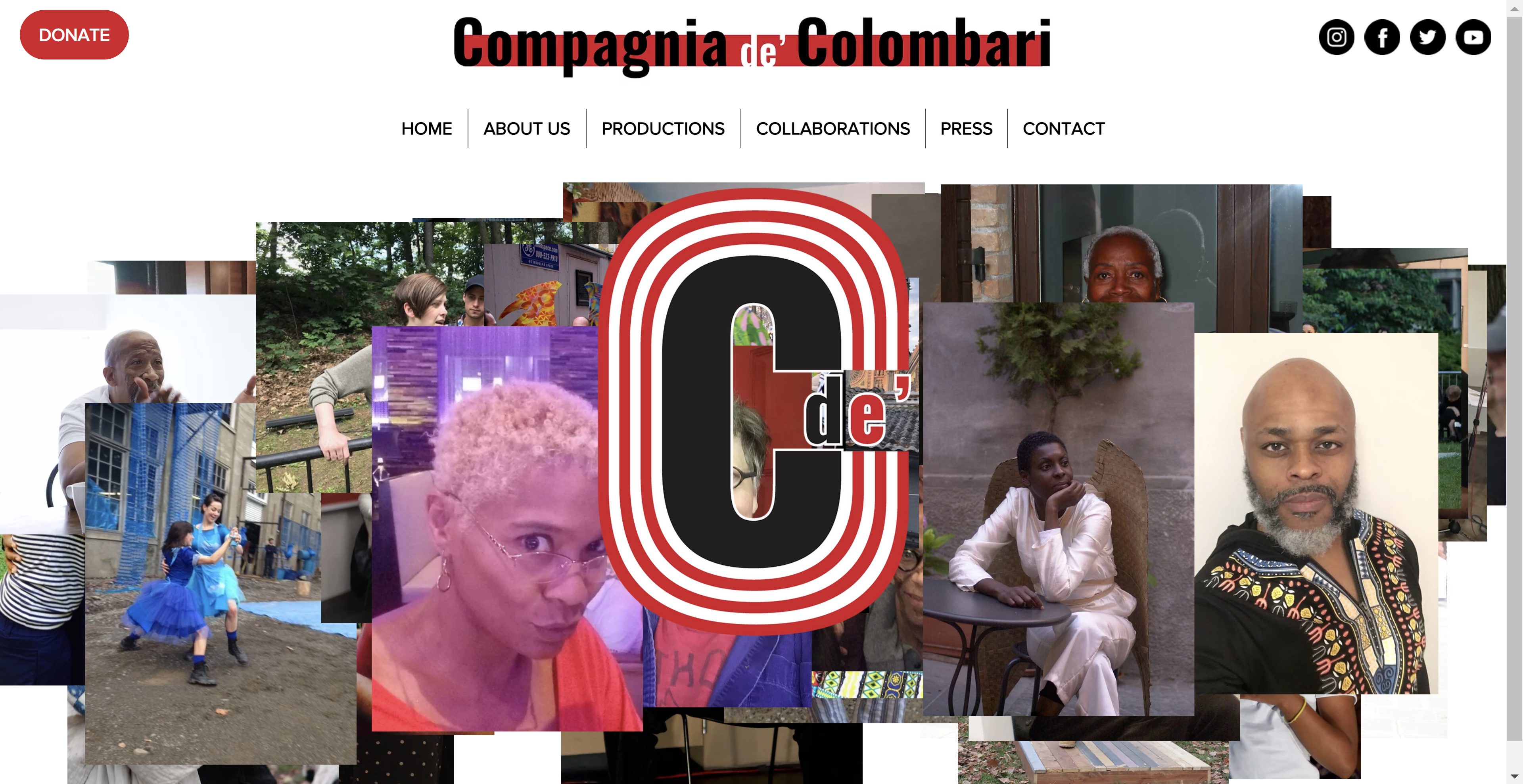
Of particular interest is the “ARTISTS” page, custom-coded to showcase countless candid photos of the group, its artists, and community members in a random layout each time the page is loaded and/or the animation loops. The homepage is also a bold and clear landing page for the site, using large tiles to direct visitors to the most important events and work to check out. The site was designed and built on Wix, the hosting platform Colombari’s original site was built on.
Identity Images
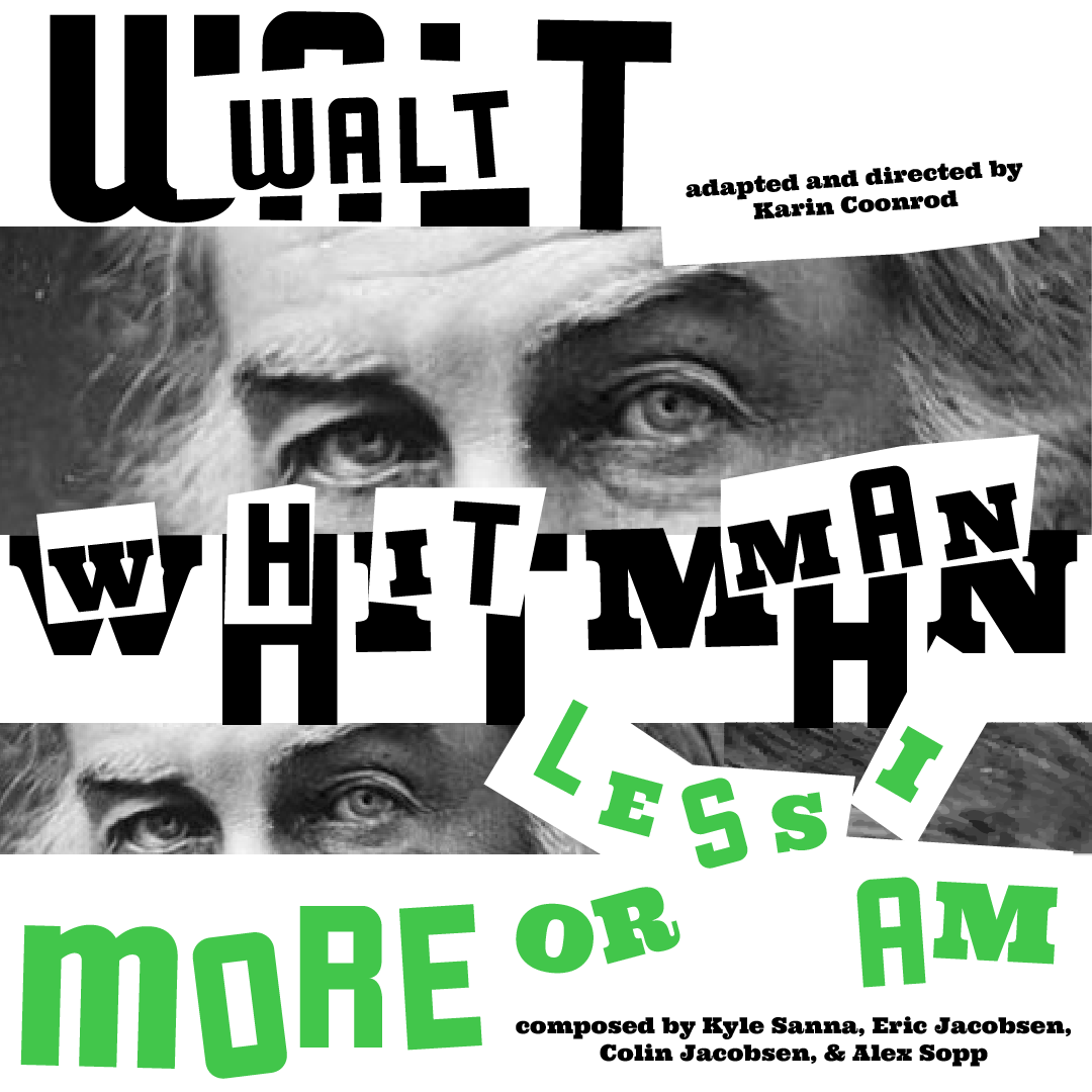
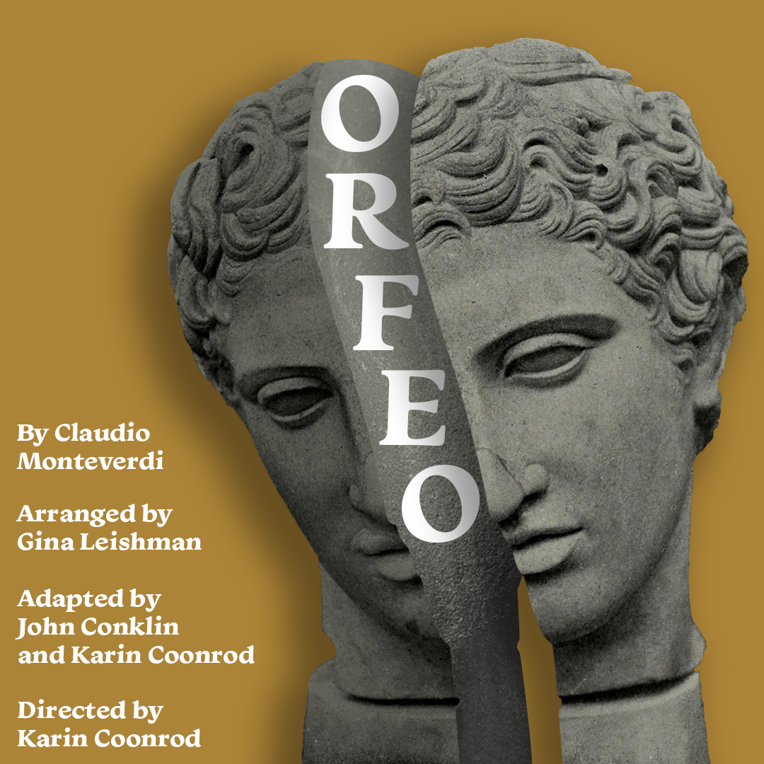
One of the most engaging parts of working with Colombari so far has been creating identity images for the group’s repertoire of productions. Each production presents a different puzzle to solve. I pore over all the available information on a given story, analyzing how to boil the narrative down to a static image. With almost complete creative control over the resulting designs, I’m able to explore different methods for conveying the essence of a story to viewers. The result is a unique image suited for each production that still conforms to my style and the brand I developed for the company.
I designed the set of images as a whole over the course of a couple years from summer 2020 to the present, using Adobe Photoshop and Illustrator primarily. For each production, the images are delivered to the company in 4 sizes for different platforms and purposes.







Stationery & Signage
After designing a new logo for Colombari, I then designed their new stationery, including new templates for their envelopes, general letterhead, and annual appeal letter. This project was challenging given the printing and editing restrictions imposed by the company. I thus designed simple yet elegant templates, starting in Adobe InDesign and translating to Microsoft Word templates for the company to edit afterward.
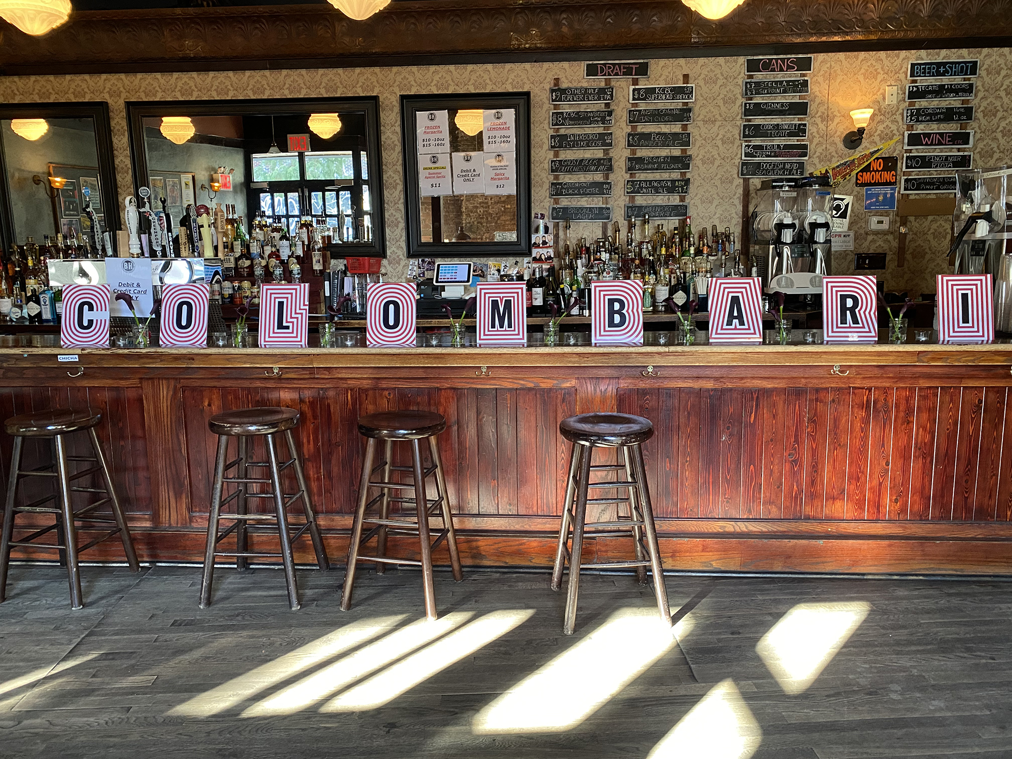
For the fall 2021 iteration of Colombari’s annual gala, I designed a series of entrance signs modeled on the company’s new logo. These signs were the centerpiece of the company’s visual presence at the gala and the first thing guests saw upon arriving. The signs were designed in Adobe Illustrator.

